


A Postcard Post
My father's favorites, pinned to the wall


I’ve strayed a bit from this newsletter’s core mission in documenting my research and writing about my father Earle Olsen’s art career in the 1950s and 1960s. That’s okay, I think, but I wondered how to connect back from, say, the last post about my birthday letter project, which had little to do with my father— or art.
Then yesterday I stumbled on a pile of postcards collected from my father’s studio before we sold his house upstate, after his death. I have referred to them occasionally, but I thought I’d do a deeper dive. What did he save and why? I set myself a constraint (constraints are so useful!) of only discussing the postcards marked with pinholes so I would know they were once tacked to his wall. None of them was ever mailed or written on. They were collected for artistic inspiration and study. What did he want to look at as he painted?
Here they are, in piles, in roughly art-historical order:
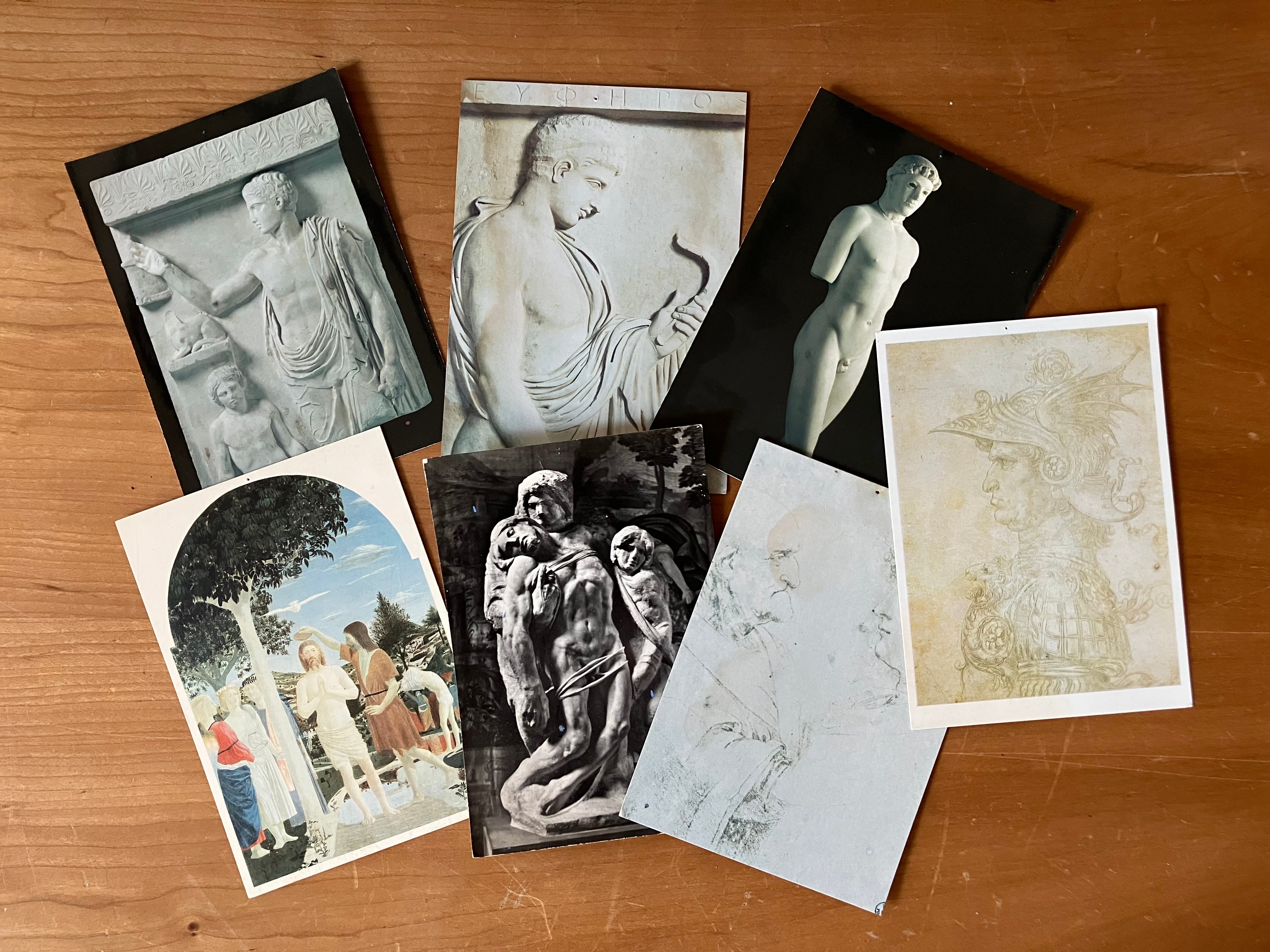
The oldest artworks are classical statuary and Italian old masters. Earle was drawn to the more modest early Renaissance paintings of Piero della Francesca and the drawings of DaVinci and Michelangelo over the better-known public commissions.
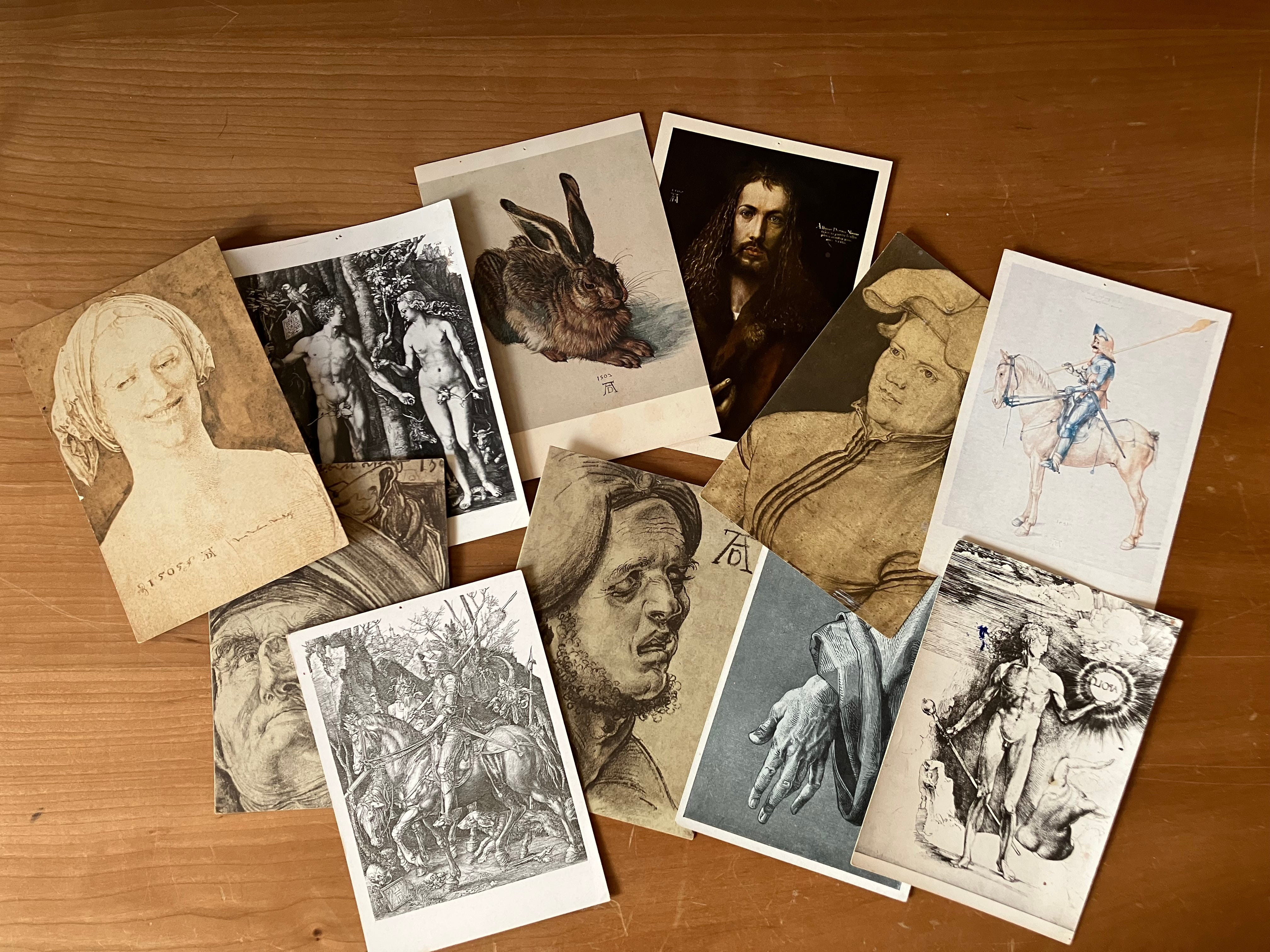
As I sorted, I was surprised to find that the largest single artist represented was Durer. Here he is in all his variety— from contorted faces to fine-lined drawing. The postcard of the hand is especially poignant, its wizened fingers full of life and personality. My father loved hands. His own were wide, with square-tipped fingers.
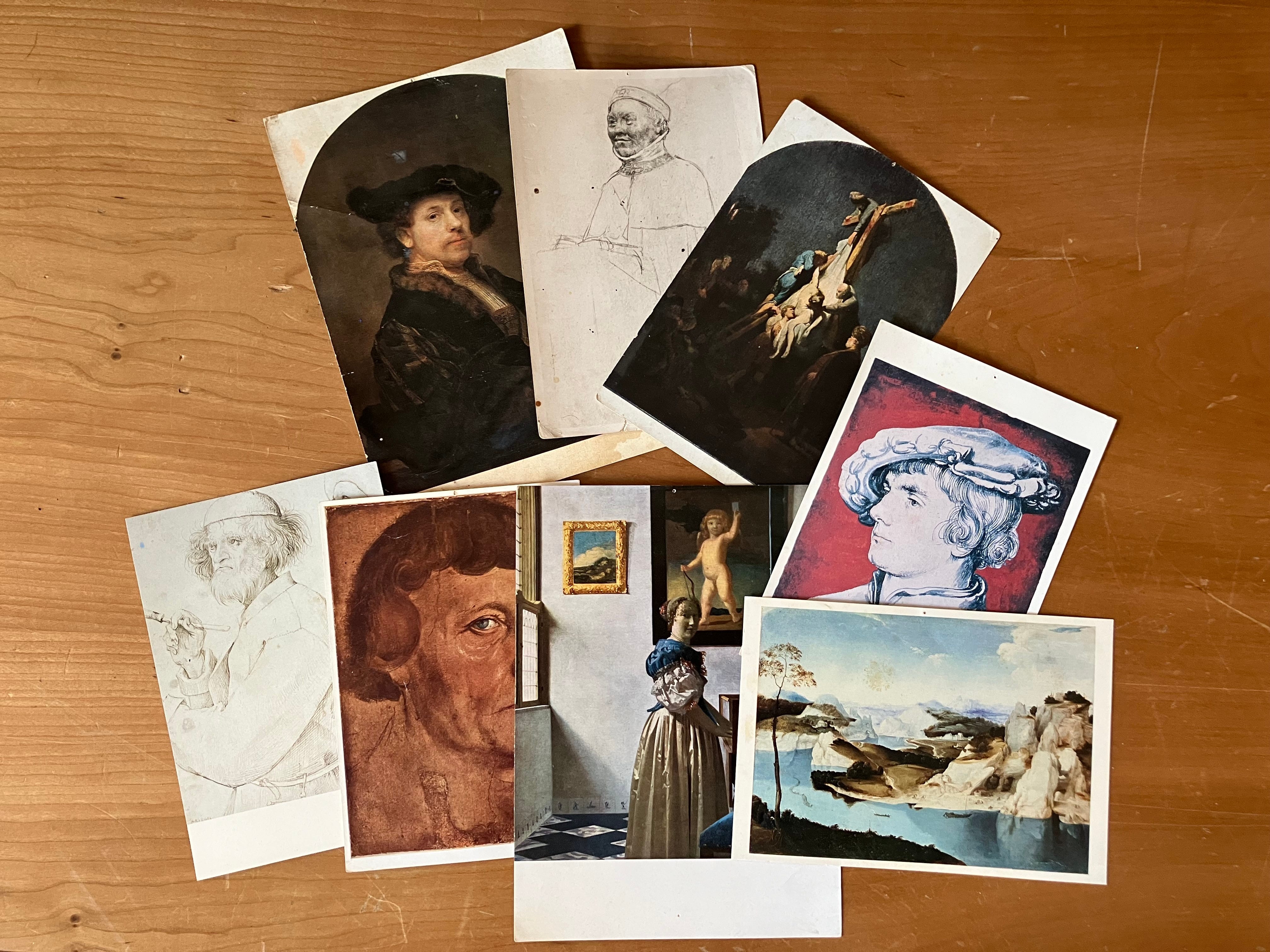
This pile is all Dutch, which is the next largest category represented. You’ll notice that almost all of these images have been figures or faces, with the rare exception here of the landscape at lower right attributed to the “Netherlandish School.” My father painted abstract landscapes early and late in his career, but his taste ran to what he called the “human comedy.” Alongside the Durers, these particular portraits feel like studies in draftsmanship— each face at a different angle, the hands in different positions.
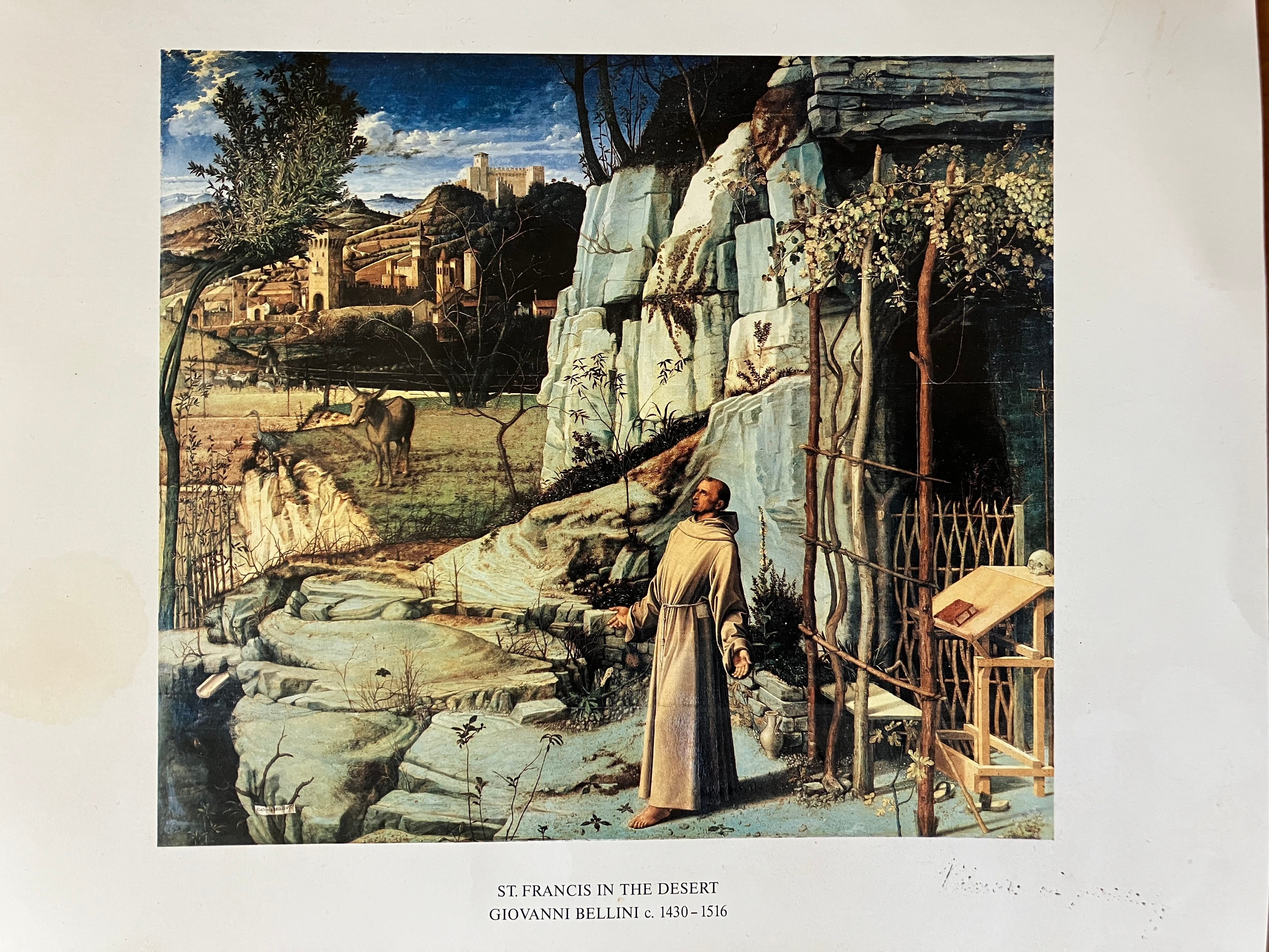
Overall, this postcard collection reveals my father’s deeply traditional tastes. There was no modern art here, no women artists, nothing non-European, though he hung a wider range of work in his home. His postcard collection held none of his later favorites either— Manet, Matisse, Sargent…. Among the postcards were a few outliers I haven’t illustrated here: a David portrait, a Daumier, a Turner landscape. There was the postcard of “Orbit” I led with, which announced a show upstate in 2000. And there was this Bellini, which we visited regularly at the Frick with my father, like a pilgrimage. Earle would stand before it like St. Francis himself, in awe. Why? The exquisite realism of the landscape that sets off the uncanny bluish stone framing the saint? The drama of that moment of revelation? This reproduction was the largest of the images my father pinned to his wall. It’s larger than you’d expect in real life too.
The only other non-postcard that earned a spot on his honor wall was a card with a photograph of the Brooklyn Bridge, taken from close to where he lived in DUMBO in the 1980s. Inside is my sister’s handwriting wishing him a Happy Father’s Day, signed by all three of his daughters.
Next week I’ll be in Buenos Aires! It’s an off week for my posts, but I’m sure I’ll write about the trip later. I’ll collect some postcards too, as I’ve done all my life, and bring them home as souvenirs. If anyone still wants a postcard by mail from my last offer, DM me on the app or reply to this email.
As always, thank you for sharing, liking, and re-posting! I look forward to any comments. What can we tell about someone from their favorite artworks?
(While we’re at it, check out this related post, about a postcard I stumbled on at the Smithsonian’s Archive of American Art. It fits the pattern of his interests—)
Zurich, 1958

“Turn every page,” Robert Caro says. So when you’re in Washington D.C. at the Smithsonian Archives of American Art flipping through the David Herbert Papers box 2 of 7, “Correspondence: Illegible and Unidentified 1958-92” folder, you might suddenly encounter your father’s handwriting.
That Bellini! Total flashback from my first ever art history class. Very cool and evocative post.
This piece is a nice way of connecting the previous postcard post to your writing about your dad. I enjoy all of your posts, even if they are not directly related to the original intent of this newsletter. Have a great trip to BA.