Marker Magic
My father's 1990s portraits
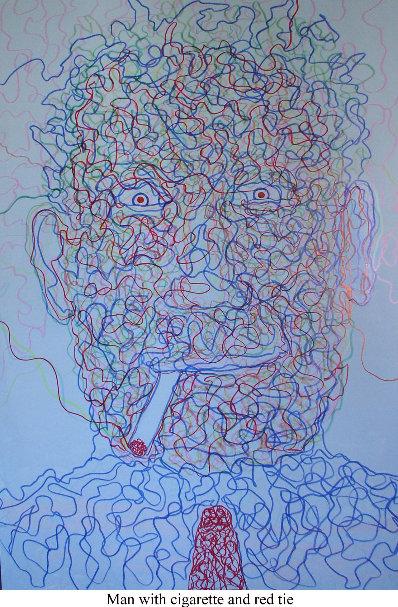
These figures dissolve, shaped with multicolored magic marker, often on foam board, which my father bought in bulk after he retired. All his art supplies came from Home Depot or Lowe’s. He spent the last 25 years of his life living on social security income, the drips of interest from his own meager retirement account, and the small checks my sisters and I sent him every month. We paid for meals whenever we went out together. He shopped carefully at Food Chopper and maintained his old house with duct tape and glue. That’s just how it was; he couldn’t afford any extras. It’s funny when writing memoir how you forget that day-to-day stuff.
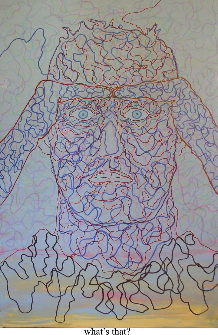
These are not my favorite works by my father1, but they vibrate with life. The intersecting, squiggly lines create tension and motion for what are otherwise pretty unremarkable faces. The figures all look forward in close up, with fixed staring eyes and an occasional accessory like a hat, cigarette, tie, or necklace. They are mostly men, and mostly invented, I think, in contrast to the Blue Sky or Human Comedy portraits he painted more realistically in the 1980s, from observation.
Let’s look at a few:
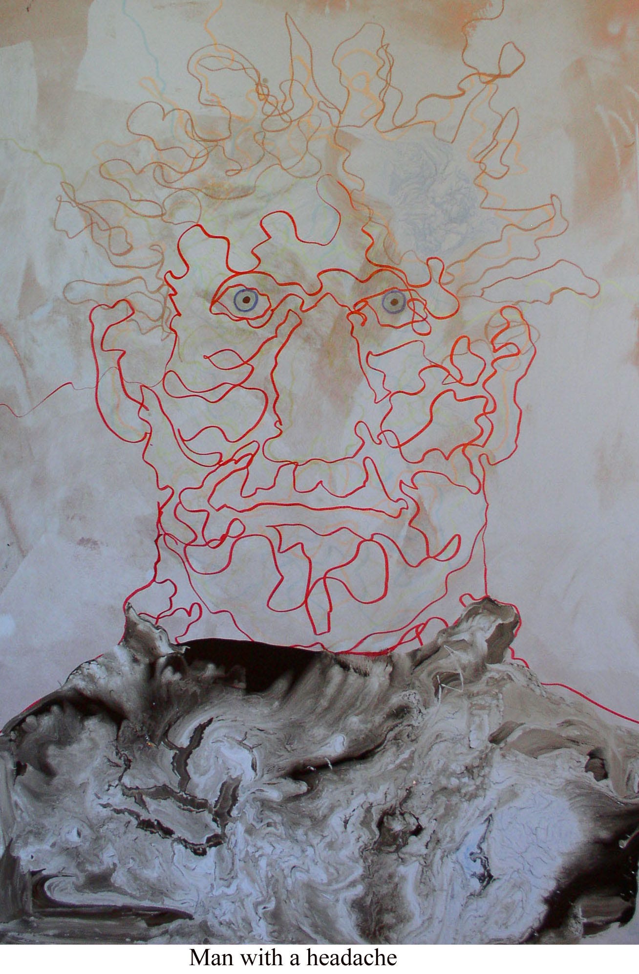
In “Man with a headache” the solid foundation of the shoulders gradually erodes into the barely sketched in face. In this one the background is mottled or muddled, and the nose seems a negative space. The palette too is lovely, from what I can tell from the reproduction. The browns and tans framing the sharp red evoke the pain and dissolution of a migraine but I think the title actually does it a disservice. The portrait implies something more existential to me than “headache.”
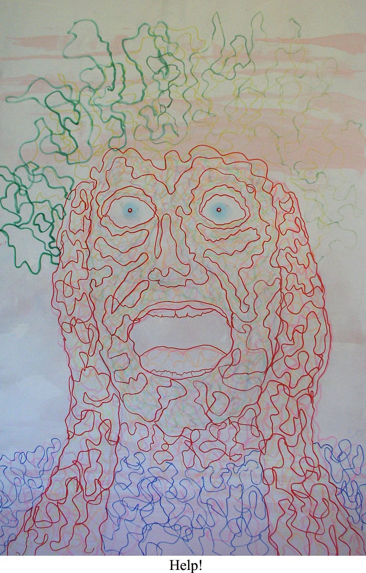
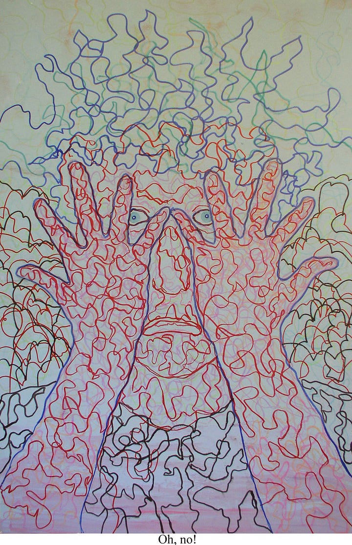
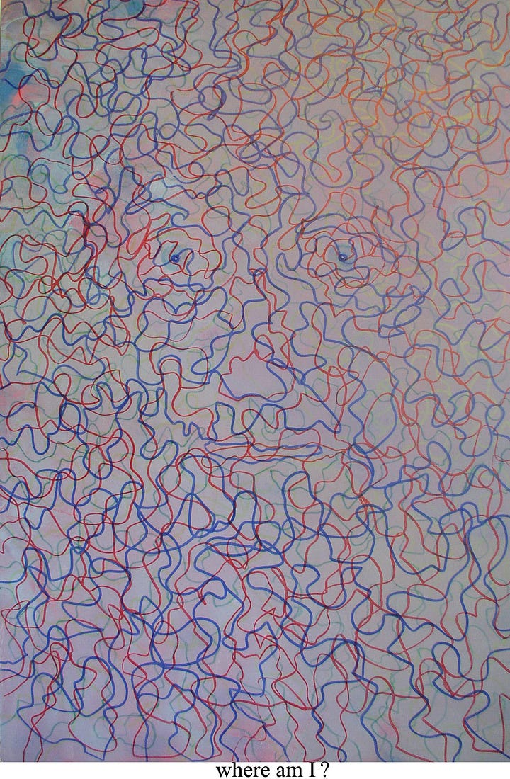
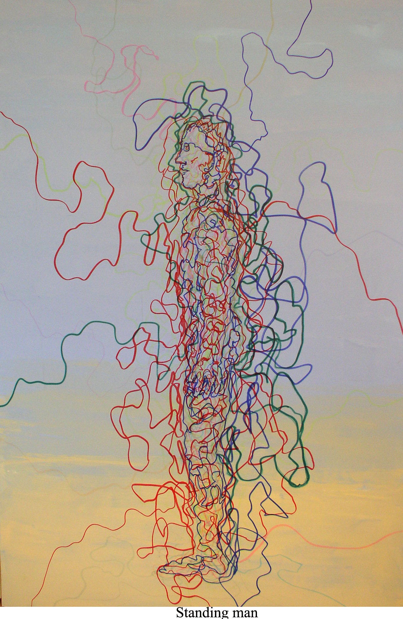
A surprising number of these works are titled with exclamation points and question marks, as if in some one-sided dialogue. My favorites have the occasional squiggly line connecting their heads to the edges of the the canvas, as if electrified by an off-screen source. You can see that best in an exception: the full-length portrait called “Standing Man,” where the figure seems jolted into being like a Frankenstein. The colored lines suddenly look like visible veins, carrying a life force.
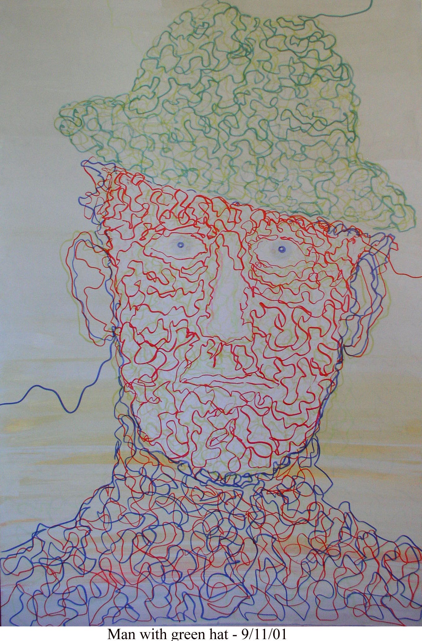
I’ve shared a few works from this series before: Gagged in the secret-telling piece about my father coming out to us and Hello Out There and Hear This in the piece about reaching out to my father’s friend Winston. In working on this essay I learned something new: I discovered a date.
Did Earle draw this on 9/11 and commemorate the date that way or is there some other private connection to the public tragedy? I have no idea. Maybe these are later than I thought. And grimmer. “They are filled with angst,” a friend noted, and I wondered if that was true of the whole series or if I had curated them for that emotion. These portraits are unsettling, but then they intentionally don’t resolve; the only fixed point are the creepy eye balls, centering the chaos. They remind me of the labyrinth books my sisters and I had as kids, tracing a wobbly line through a maze, retracing dead ends toward the prize.2
The works are literally “line drawings”: each image is a continuous line (or lines?) folding in on itself and defining a gap. My father loved the expressive line of artists like Matisse, who inserted or extracted (which is it?) so much verve and life into a single pass of the pen. Those lines, and my father’s here, function as some extension of the artist himself, a direct connection from eye to hand to surface. I realize now that they are also a testament to “making do”— to how much you can do with how little, which was a prevailing theme of my father’s life in retirement. They are exercises in simplicity.
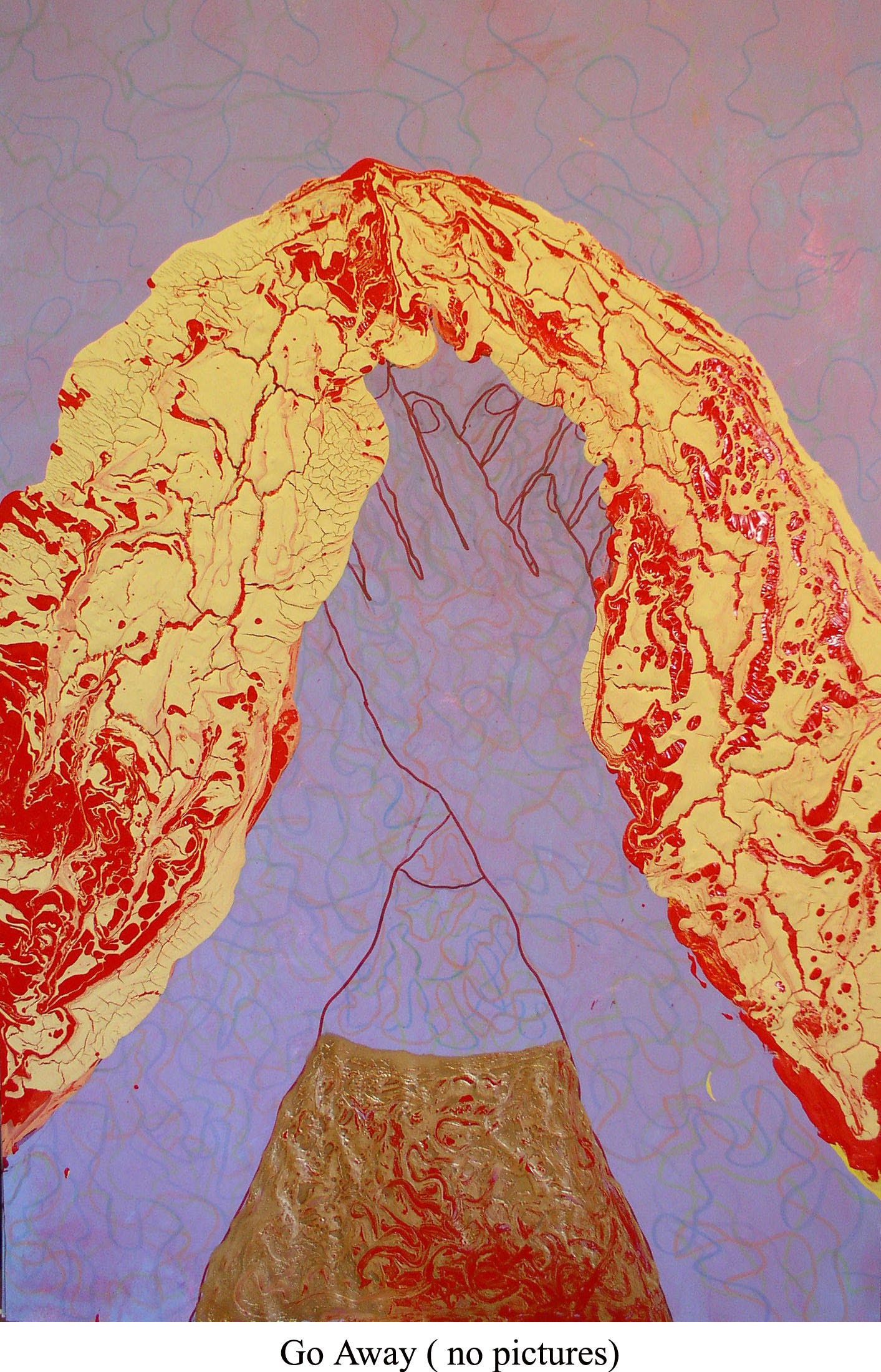
The magic marker phase ended as my father gradually transitioned into new works, where he poured thick layers of paint for a gilded effect. You can see that emerging in the shoulders of “Man with a headache.” In “Go Away (no pictures)” he goes further, using magic marker only for the visible skin and background. The face is entirely covered and the image is dominated by the bright red-gold of hair and shirt, which jumps out from the foam board in relief.3 This picture is moving on. That heavy coating of cracked paint will become mixed-media trees and landscapes in another phase, to come.
This post is a part of a series of pieces on different stages of my father’s work.4 Chronologically, they fall in this order: his 1940s student work, 1950s abstracts, 1960s works on plexi, 1980s Blue Sky/Human Comedy, and now 1990s magic marker portraits. You can find more of my father’s work, including examples from each decade, on this website.
Thank you for reading! I have a detour in mind for the next piece: a description of my recent trip to London for Victorian research and a visit to a show of Julia Margaret Cameron’s work at the Morgan Library this summer. Stay tuned….and I look forward to your thoughts and comments! I cherish this community.
Why do I feel compelled to say that? There’s a permeable boundary between me and him; praising his work feels like bragging about my own, instead I’m as critical of his work as I’d be of my own.
I can picture that square paperback so clearly that I looked for it on the internet, but didn’t find it. I’ve seen it recently somewhere though….
I’ll admit, I love this one. Also, it reminds me of my red-haired child who often hid from photos.
I am very grateful to
and for their feedback on the more recent pieces, including this one. Thank-you-emoji!

One of the things that I find so moving about your father’s career is the way idea follows idea follows idea. There’s a questing there that I really admire. These feel so provisional and immaterial—you say that they’re “unresolved” and I feel that so strongly. It’s like the lines themselves are a part of the quest.
Oh, my! Things fall apart, the center cannot hold. He pulls me into the heart of a great unraveling, in which only the eyes are not morphing into formlessness. What an unnerving portrayal of an artist’s impoverished old age.